
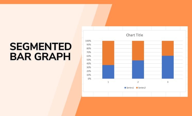
A segmented bar graph is one of the simplest and most powerful tools for comparing parts of a whole. Whether you’re analyzing survey results, business data, or student performance, segmented bar graphs can show you how each category breaks down—all in a single glance.
In this guide, we’ll walk you through what a segmented bar graph is, why it’s useful, how to create one, and show you a few examples. Let’s make this visual tool easy to understand.
What Is a Segmented Bar Graph?
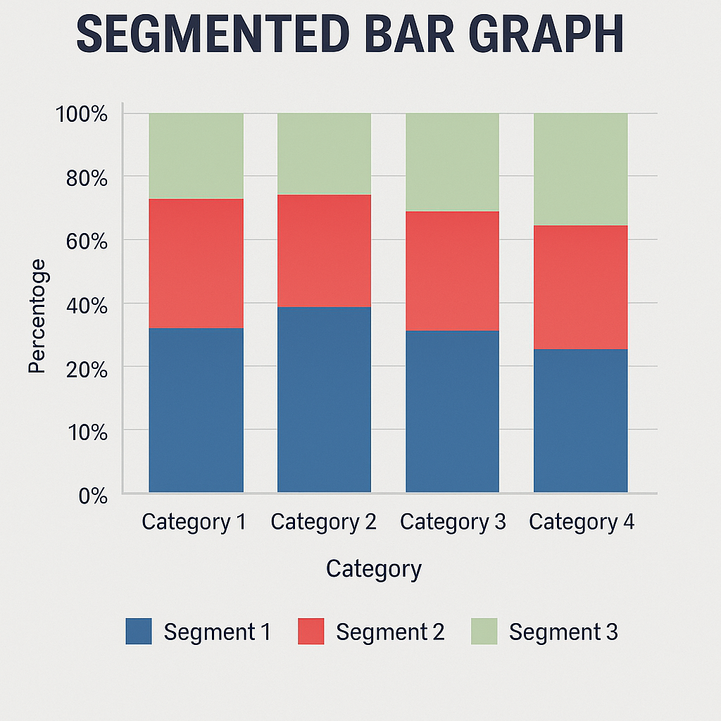
A segmented bar graph, also known as a stacked bar graph, is a bar chart where each bar is divided into segments that represent different parts of a total. Every bar represents a complete group, and each colored section within the bar shows how much of that group falls into a particular category.
Where Is It Used?
Segmented bar graphs are widely used in:
- Education: Showing test scores by subject and student group
- Marketing: Displaying customer preferences across demographics
- Business: Comparing sales by product category and region
- Surveys: Visualizing answer choices across different age groups
How Does It Differ from a Regular Bar Graph?
| Bar Graph | Segmented Bar Graph |
| Shows one value per bar | Shows multiple values within one bar |
| Great for one variable | Perfect for breaking down a total into categories |
| Bars are separate | Bars are stacked in a single row or column |
| Easier for simple comparisons | Better for grouped or layered data analysis |
How to Read a Segmented Bar Graph
Here’s a quick example.
Imagine you surveyed 100 students about their favorite fruit. Each bar represents a grade level (e.g., Grade 6, Grade 7), and segments within the bar represent the fruit they chose: apples, bananas, oranges.
- The whole bar = 100% of responses in that grade
- Each segment’s size = % of students who chose that fruit
This lets you compare both:
- Preferences within each grade, and
- How those preferences change across different grades.
How to Create a Segmented Bar Graph?
You can make a segmented bar graph in tools like Excel, Google Sheets, or with a Free Bar Graph Maker. Here’s how:
Step 1: Prepare Your Data
Organize your data into a table format:
| Grade Level | Apples | Bananas | Oranges |
| Grade 6 | 30 | 50 | 20 |
| Grade 7 | 40 | 30 | 30 |
Each row represents a group (Grade Level), and each column after the first shows subcategory values.
Step 2: Open Your Tool of Choice
Choose your preferred method:
- How to Make a Bar Graph in Excel
- How to Make a Bar Graph in Google Sheets
- Free Bar Graph Maker – No downloads, instant graph!
Step 3: Create the Graph
In Excel or Sheets:
- Highlight your full data table.
- Go to Insert > Chart.
- Choose Stacked Bar Chart.
- Adjust labels and colors for clarity.
In online graph tools:
- Paste your data
- Select “Segmented” or “Stacked Bar”
- Customize colors and export the image
Step 4: Customize It
For best results:
- Use distinct colors for each segment
- Add legends so viewers know what each color represents
- Label percentages or numbers inside each segment if needed
- Keep labels clear and consistent
When Should You Use a Segmented Bar Graph?
Use this graph when:
- You want to compare parts of a total
- Your data includes grouped subcategories
- You want a clean visual for a presentation or report
Avoid using it if:
- You need to compare only one variable per group (use a simple bar graph instead)
- Your dataset has too many subcategories (it may become hard to read)
Real-Life Example: Mobile Usage by Age Group
| Age Group | Social Media | Gaming | Productivity | Other |
| 18–25 | 50% | 30% | 10% | 10% |
| 26–40 | 40% | 20% | 30% | 10% |
A segmented bar graph helps you instantly see that younger users spend more time on social media and gaming, while older users lean more toward productivity apps.
Final Thoughts
A segmented bar graph is more than just a pretty chart—it’s a powerful tool to compare, analyze, and present grouped data. Whether you’re in business, education, or research, it’s a quick way to visualize how parts make up a whole.
FAQ: Segmented Bar Graphs
Q1. Is a segmented bar graph the same as a stacked bar graph?
Yes, both terms are used interchangeably to describe bars split into colored segments.
Q2. Can I use percentages instead of raw numbers?
Absolutely. Many segmented bar graphs are designed to show percentages to highlight proportion.
Q3. How many segments is too many?
Stick to 3–5 segments per bar. More than that can overwhelm the reader.
Q4. Can I make segmented bar graphs horizontally?
Yes! Horizontal segmented bars are great for text-heavy labels.