

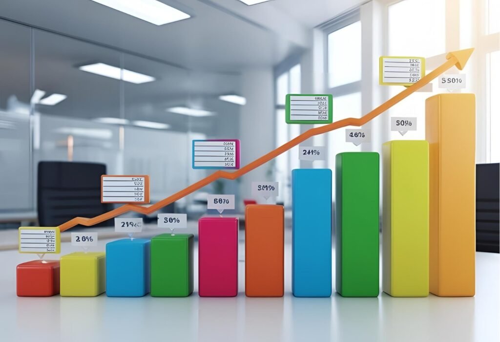
A bar graph or bar chart is a visual tool used to compare values across different categories using rectangular bars. Each bar’s length or height represents the value of the data point.
When to Use a Bar Graph?
- To compare quantities between different groups.
- To show changes over time (if intervals are not continuous).
- To highlight differences clearly between categories.
How to Make a Bar Graph in Excel?
Step 1: Enter Your Data
- Open Excel.
- In Column A, type your categories (e.g., Products, Months).
- In Column B, type your values (e.g., Sales numbers, Amounts).
Example:
| A | B |
|---|---|
| Product A | 50 |
| Product B | 75 |
| Product C | 30 |
Step 2: Select Your Data
- Click and drag to highlight both columns (A and B) including headers.
Step 3: Insert a Bar Graph
- Go to the Insert tab in the top ribbon.
- Click on Insert Column or Bar Chart (it looks like a bar icon).
- Choose Clustered Bar or Clustered Column.
Step 4: Customize Your Graph (Optional)
- Add a title: Click on the default chart title and type yours.
- Change colors: Use the Chart Design tab.
- Add data labels: Click the chart → “+” icon → check “Data Labels”.
Step 5: Save or Export
- Right-click the chart → Save as Picture if you want to use it elsewhere.
- Or simply save the Excel file.
Advantages
- Easy to understand at a glance.
- Great for comparing multiple groups.
- Useful in presentations and reports.
Advanced Tips for Bar Graphs
🧠 1. Use Data Labels Wisely
- Add data labels for clarity, but avoid clutter.
- Use inside end or outside end positions depending on bar length.
🎨 2. Customize Bar Colors
- Use different colors to highlight key bars.
- Apply a gradient fill or use conditional formatting for dynamic visuals.
📏 3. Adjust Axis Settings
- Set a fixed minimum and maximum for consistent scale.
- Remove unnecessary gridlines to reduce chart noise.
📊 4. Sort Data for Impact
- Sort your data largest to smallest to emphasize key differences.
- Helps in storytelling and makes the graph easier to interpret.
🧩 5. Add a Secondary Axis
- Useful when comparing two data sets with different units.
- Example: Sales volume vs. profit margin.
🗂 6. Use Grouped or Stacked Bars
- Grouped bars compare sub-categories side-by-side.
- Stacked bars show how components contribute to a total.
✨ 7. Add Trendlines or Annotations
- Trendlines show overall direction or pattern.
- Use text boxes or callouts for specific notes.
📷 8. Export as High-Quality Image
- Right-click the chart > Save as Picture.
- Choose PNG or SVG for sharp quality in presentations or websites.
💡 Pro Tip: Use Named Ranges or Tables
- Link your graph to dynamic named ranges or Excel Tables.
- Your chart will auto-update when data changes!